7:49 PM
 One of the most important parts of a person’s Facebook presence is their profile photo. This is displayed in the top left corner of a page. The photo can be a newly uploaded image or it may be drawn from any of your online albums.
Typically, a profile photo shows someone’s face, and appears in front of the light blue-grey line that connects from the left side of the profile to the left-most tab. View an example of a typical profile page with a normal photo.
Unlike Myspace, Facebook’s uses a common color and layout for every profile. This makes the site look better overall, but also limits your ability to affect the look of your profile. You can display Facebook applications on the left sidebar, and have them in tabs, but any changes to how the page’s style or how it is displayed overall are limited.
Hacking the Facebook Profile Photo
There isn’t a legal way to ‘hack’ Facebook, but there is a method to changing your profile photo to make your profile look subtly different and cooler. It isn’t obvious, but the placement of a profile photo allows you to lightly innovate on Facebook’s sacred profile layout.
How Does It Work?
When you create a profile photo from an existing album image, Facebook lets you crop the photo down to whatever dimensions you choose. When you visit your profile the selected photo is displayed scaled down to a maximum height and width allowed by Facebook.
The first thing you need to understand is how much space you have to play with. Facebook displays profile photos at a maximum of 200 pixels in width. If you go beyond this, Facebook resizes your profile photo down to 200 while maintaining the aspect ratio vertically. Facebook will display a photo in your profile that is up to 600 pixels in height. This means that Facebook will happily display any image as large as 200 x 600 without otherwise changing or resizing it.

Now that you know the maximum dimensions of your profile photo, the base trick is simple. Facebook is set up to display the top of an image 52 pixels north of the thin grey line. Normally, all profile photos are placed at this height above the line.
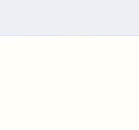
In order to achieve an unbroken line across your profile you need only create an image with a grey (#D8DFEA) 52 pixels below the top. In addition, you’ll need to paintbucket the area above the line to match the light blue (#EFF0F5) used in the profile header.
For more information about the colors used in Facebook’s style sheet, see this guide for Facebook application developers by Bill Konrad. I wrote a Facebook application about a year ago, read about the DMB Facebook application here.
Subbing this blank template allows you to achieve something Facebook normally does not allow: the option to not display a profile photo at all. A new Facebook account with no profile photo displays a box with a drawing of a mystery person with soft-serve icecream hair on it. Using a blank lined template allows you to add a little ‘negative’ space to your profile that is normally not possible.
The fun begins when you overlay a photo or image on top of the blank template. The hardest part about doing this is isolating an image so that it can cleanly offset the background template. My suggestion for this is to use Adobe Photoshop to draw a selection area around your photo or image and then remove the edges.

There are a lot of fun things you can do pairing foreground cutout images with the background Facebook template. The first one I did was to create a sort of mini-living room for me to hang out in. Here’s a screenshot of my profile using this particular photo.
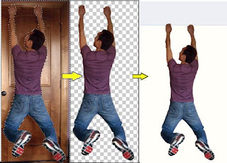
I wanted to do a play on the little grey line and decided to try to create the illusion that I was hanging from it. I started by taking a photograph of me hanging from a doorway and then isolating the image. I then overlayed the photo on a longer version of the blank Facebook profile photo template.

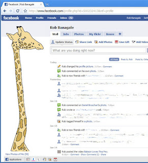
Another fun foreground image I used was a colored in Giraffe. This gave my profile a fun look and because it pushed down the information in my left sidebar, a lot of negative space around my wall updates.
Here’s a look at that process and the final result:

View a screenshot of the complete profile using the ‘giraffe hack.’

A lot more can be done with the look of the thin grey line, such as creating a jagged or curved edge that interacts with an overlayed image. I got a little weird and created some stalactites over a green unicorn with the Earth floating above and below the header line. View a screenshot of the complete profile using the ‘green unicorn hack.’
Image isolation in Photoshop is like using scissors to cut very closely around a photo torn from a magazine. Photoshop has a magnetic lasso, a magic wand and a quick selection tool to help you. There are a lot of guides on how to perform selections, here are a few that will help you:
Image isolation in Photoshop is like using scissors to cut very closely around a photo torn from a magazine. Photoshop has a magnetic lasso, a magic wand and a quick selection tool to help you. There are a lot of guides on how to perform selections, here are a few that will help you:
A PDF on object selection and isolation
A video on object selection and isolation
A web tutorial with images on the Quick Selection tool.
I’m including the some example images to help you get started in a zip file at the end of this entry.
Hack Caveats
The hack falls apart a few different ways. The easiest is to post a status update that is long enough to wrap around to two lines of text. You can avoid this by posting your long status update, and then clearing it afterwards. View a screenshot of this problem. This leaves your current status as blank, but the update will still appear on your news reel and the illusion of the hack will be maintained.
Another point of note in using this hack is the display of your profile photo in wall listings. The profile photo is shrunk down quite a bit. A plus of this is that if you choose a long, 200×600 photo, it can look rather cool and set you apart from other Facebook people when you’re shown in a list.
Conclusion and Downloads
For many, your Facebook presence is an important part of your online presentation of self. You can differentiate yourself on Facebook by tweaking the look of your profile by using a specialized profile photo.
I’m making available a zip file that includes a number of original, layered .psd files that will help you get a quick start on hacking your Facebook profile photo. I’d love to see some examples of other ideas people come up with. Feel free to post or send me a screenshot of what you came up with and I’ll add it to this blog post.
2 Responses to "5 Creative Ways to Hack Your Facebook Profile Photo"

Post a Comment